##     sessionID dept level    sem enroll     iid
## 1 session1784    M   100 FA1991     22 inst265
## 2 session1785    k   100 FA1991     52 inst458
## 3 session1791    J   100 FA1993     22 inst223
## 4 session1792    J   300 FA1993     20 inst235
## 5 session1794    J   200 FA1993     22 inst234
## 6 session1795    J   200 SP1994     26 inst230
## 'data.frame':    1718 obs. of  6 variables:
##  $ sessionID: chr  "session1784" "session1785" "session1791" "session1792" ...
##  $ dept     : chr  "M" "k" "J" "J" ...
##  $ level    : int  100 100 100 300 200 200 200 100 300 100 ...
##  $ sem      : chr  "FA1991" "FA1991" "FA1993" "FA1993" ...
##  $ enroll   : int  22 52 22 20 22 26 25 38 16 43 ...
## $ iid : chr "inst265" "inst458" "inst223" "inst235" ...12 Working with character data: Factors
Learning goals
- Understand the difference between
characterandfactorvariables. - Be able to convert a
charactervariable to afactor. - Develop comfort in manipulating the order and values of a factor.
Additional resources
Read:
- forcats cheat sheet
- Factors book chapter (Wickham & Grolemund)
12.1 Warm-up
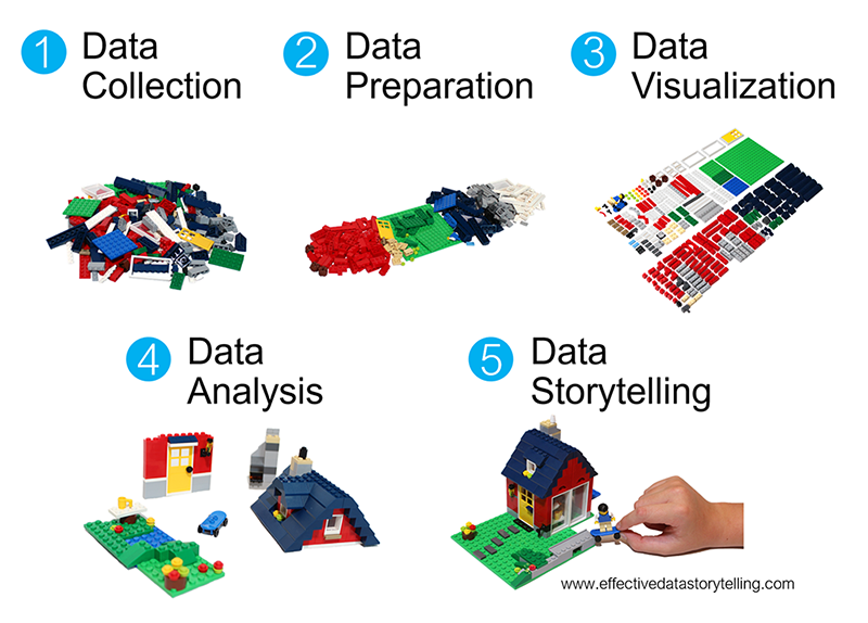
Where are we? Data preparation
Thus far, we’ve learned how to:
- do some wrangling:
arrange()our data in a meaningful order- subset the data to only
filter()the rows andselect()the columns of interest mutate()existing variables and define new variablessummarize()various aspects of a variable, both overall and by group (group_by())
- reshape our data to fit the task at hand (
pivot_longer(),pivot_wider()) join()different datasets into one
What next?
In the remaining days of our data preparation unit, we’ll focus on working with special types of “categorical” variables: characters and factors. Variables with these structures often require special tools and considerations.
We’ll focus on two common considerations:
- Regular expressions
When working with character strings, we might want to detect, replace, or extract certain patterns. For example, recall our data oncourses:
Focusing on just the sem character variable, we might want to…
- change
FAtofall_andSPtospring_ - keep only courses taught in fall
- split the variable into 2 new variables:
semester(FAorSP) andyear
- Converting characters to factors (and factors to meaningful factors) (today)
When categorical information is stored as a character variable, the categories of interest might not be labeled or ordered in a meaningful way. We can fix that!
EXAMPLE 1
Recall our data on presidential election outcomes in each U.S. county (except those in Alaska):
library(tidyverse)
elections <- read.csv("https://mac-stat.github.io/data/election_2020_county.csv") %>%
  select(state_abbr, historical, county_name, total_votes_20, repub_pct_20, dem_pct_20) %>%
  mutate(dem_support_20 = case_when(
    (repub_pct_20 - dem_pct_20 >= 5) ~ "low",
    (repub_pct_20 - dem_pct_20 <= -5) ~ "high",
    .default = "medium"
  ))

# Check it out
head(elections)
##   state_abbr historical    county_name total_votes_20 repub_pct_20 dem_pct_20
## 1         AL        red Autauga County          27770        71.44      27.02
## 2         AL        red Baldwin County         109679        76.17      22.41
## 3         AL        red Barbour County          10518        53.45      45.79
## 4         AL        red    Bibb County           9595        78.43      20.70
## 5         AL        red  Blount County          27588        89.57       9.57
## 6         AL        red Bullock County           4613        24.84      74.70
##   dem_support_20
## 1            low
## 2            low
## 3            low
## 4            low
## 5            low
## 6           high
Check out the below visual and numerical summaries of dem_support_20:
- low = the Republican won the county by at least 5 percentage points
- medium = the Republican and Democrat votes were within 5 percentage points
- high = the Democrat won the county by at least 5 percentage points
ggplot(elections, aes(x = dem_support_20)) +
  geom_bar()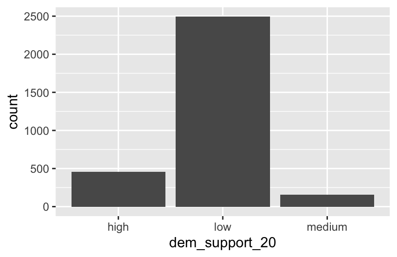
elections %>%
  count(dem_support_20)
##   dem_support_20    n
## 1           high  458
## 2            low 2494
## 3         medium  157
Follow-up:
What don’t you like about these results?
EXAMPLE 2: Creating factor variables with meaningfully ordered levels (fct_relevel)
The above categories of dem_support_20 are listed alphabetically, which isn’t particularly meaningful here. This is because dem_support_20 is a character variable and R thinks of character strings as words, not category labels with any meaningful order (other than alphabetical):
str(elections)
## 'data.frame':    3109 obs. of  7 variables:
##  $ state_abbr    : chr  "AL" "AL" "AL" "AL" ...
##  $ historical    : chr  "red" "red" "red" "red" ...
##  $ county_name   : chr  "Autauga County" "Baldwin County" "Barbour County" "Bibb County" ...
##  $ total_votes_20: int  27770 109679 10518 9595 27588 4613 9488 50983 15284 12301 ...
##  $ repub_pct_20  : num  71.4 76.2 53.5 78.4 89.6 ...
##  $ dem_pct_20    : num  27.02 22.41 45.79 20.7 9.57 ...
##  $ dem_support_20: chr  "low" "low" "low" "low" ...
We can fix this by using fct_relevel() to both:
Store
dem_support_20as a factor variable, the levels of which are recognized as specific levels or categories, not just words.Specify a meaningful order for the levels of the factor variable.
# Notice that the order of the levels is not alphabetical!
elections <- elections %>%
  mutate(dem_support_20 = fct_relevel(dem_support_20, c("low", "medium", "high")))

# Notice the new structure of the dem_support_20 variable
str(elections)
## 'data.frame':    3109 obs. of  7 variables:
##  $ state_abbr    : chr  "AL" "AL" "AL" "AL" ...
##  $ historical    : chr  "red" "red" "red" "red" ...
##  $ county_name   : chr  "Autauga County" "Baldwin County" "Barbour County" "Bibb County" ...
##  $ total_votes_20: int  27770 109679 10518 9595 27588 4613 9488 50983 15284 12301 ...
##  $ repub_pct_20  : num  71.4 76.2 53.5 78.4 89.6 ...
##  $ dem_pct_20    : num  27.02 22.41 45.79 20.7 9.57 ...
##  $ dem_support_20: Factor w/ 3 levels "low","medium",..: 1 1 1 1 1 3 1 1 1 1 ...
# And plot dem_support_20
ggplot(elections, aes(x = dem_support_20)) +
geom_bar()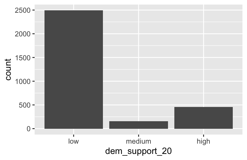
EXAMPLE 3: Changing the labels of the levels in factor variables
We now have a factor variable, dem_support_20, with categories that are ordered in a meaningful way:
elections %>%
  count(dem_support_20)
##   dem_support_20    n
## 1            low 2494
## 2         medium  157
## 3           high  458
But maybe we want to change up the category labels. For demo purposes, let’s create a new factor variable, results_20, that’s the same as dem_support_20 but with different category labels:
# We can redefine any number of the category labels.
# Here we'll relabel all 3 categories:
elections <- elections %>%
  mutate(results_20 = fct_recode(dem_support_20,
                                 "strong republican" = "low",
                                 "close race" = "medium",
                                 "strong democrat" = "high"))

# Check it out
# Note that the new category labels are still in a meaningful,
# not necessarily alphabetical, order!
elections %>%
  count(results_20)
##          results_20    n
## 1 strong republican 2494
## 2        close race  157
## 3   strong democrat  458
EXAMPLE 4: Re-ordering factor levels
Finally, let’s explore how the Republican vote varied from county to county within each state:
# Note that we're just piping the data into ggplot instead of writing
# it as the first argument
elections %>%
  ggplot(aes(x = repub_pct_20, fill = state_abbr)) +
    geom_density(alpha = 0.5)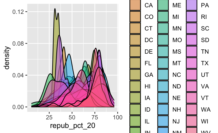
This is too many density plots to put on top of one another. Let’s spread these out while keeping them in the same frame, hence easier to compare, using a joy plot or ridge plot:
library(ggridges)
elections %>%
  ggplot(aes(x = repub_pct_20, y = state_abbr, fill = historical)) +
    geom_density_ridges() +
    scale_fill_manual(values = c("blue", "purple", "red"))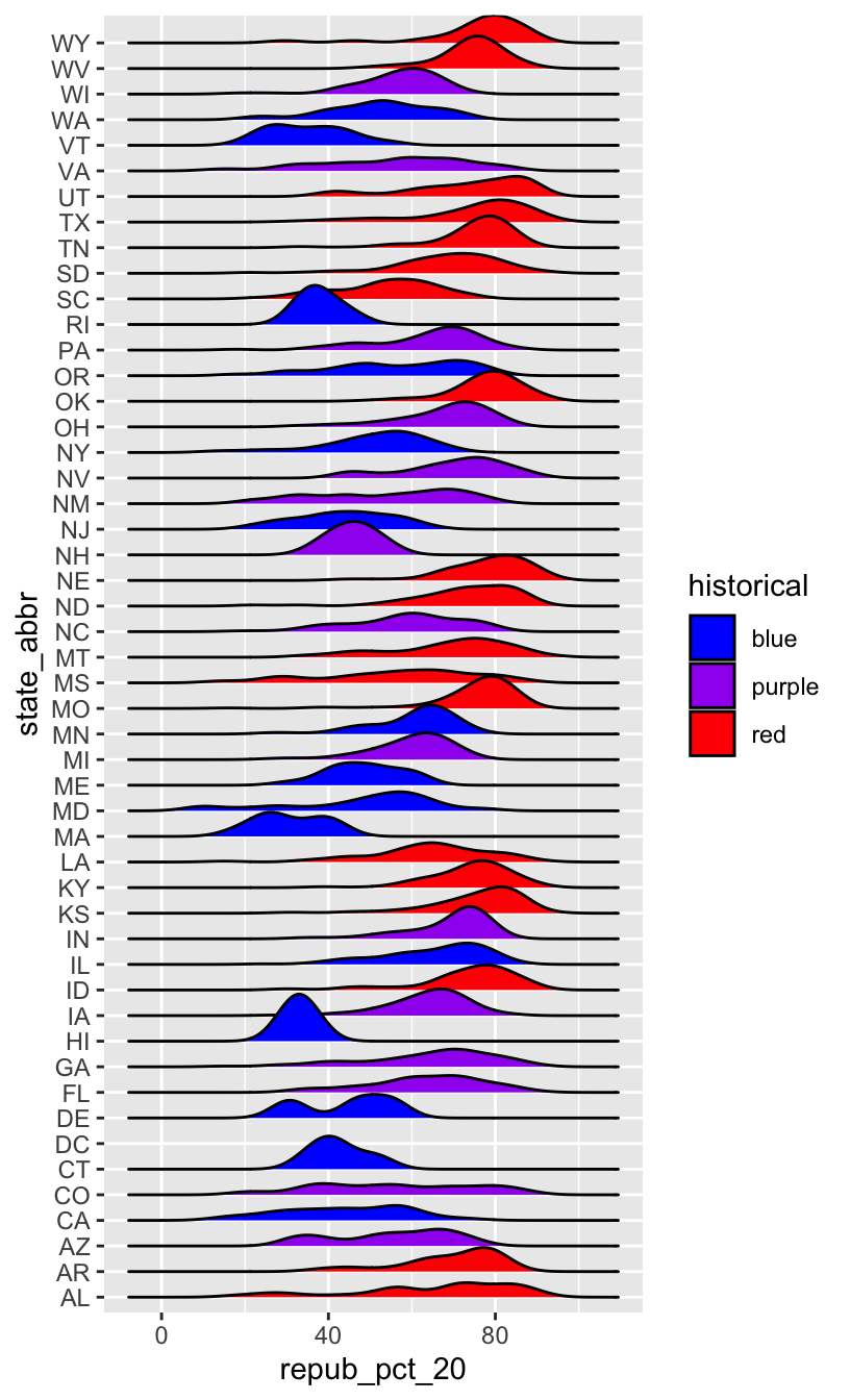
OK, but this is alphabetical. Suppose we want to reorder the states according to their typical Republican support. Recall that we did something similar in Example 2, using fct_relevel() to specify a meaningful order for the dem_support_20 categories:
fct_relevel(dem_support_20, c("low", "medium", "high"))
We could use fct_relevel() to reorder the states here, but what would be the drawbacks?
EXAMPLE 5: Re-ordering factor levels according to another variable
When a meaningful order for the categories of a factor variable can be defined by another variable in our dataset, we can use fct_reorder(). In our joy plot, let’s reorder the states according to their median Republican support:
# Since we might want states to be alphabetical in other parts of our analysis,
# we'll pipe the data into the ggplot without storing it:
elections %>%
  mutate(state_abbr = fct_reorder(state_abbr, repub_pct_20, .fun = "median")) %>%
  ggplot(aes(x = repub_pct_20, y = state_abbr, fill = historical)) +
    geom_density_ridges() +
    scale_fill_manual(values = c("blue", "purple", "red"))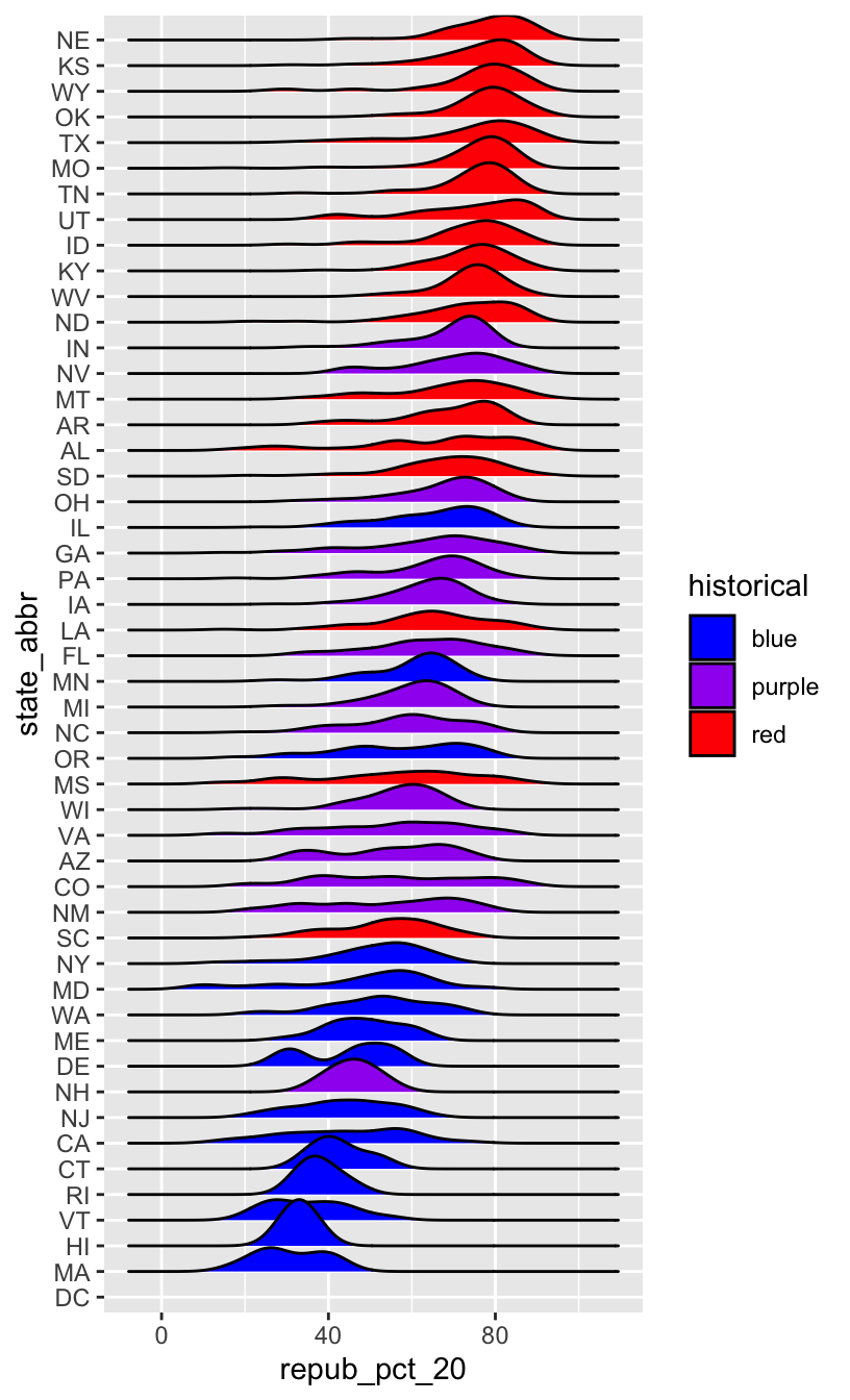
# How did the code change?
# And the corresponding output?
elections %>%
  mutate(state_abbr = fct_reorder(state_abbr, repub_pct_20, .fun = "median", .desc = TRUE)) %>%
  ggplot(aes(x = repub_pct_20, y = state_abbr, fill = historical)) +
    geom_density_ridges() +
    scale_fill_manual(values = c("blue", "purple", "red"))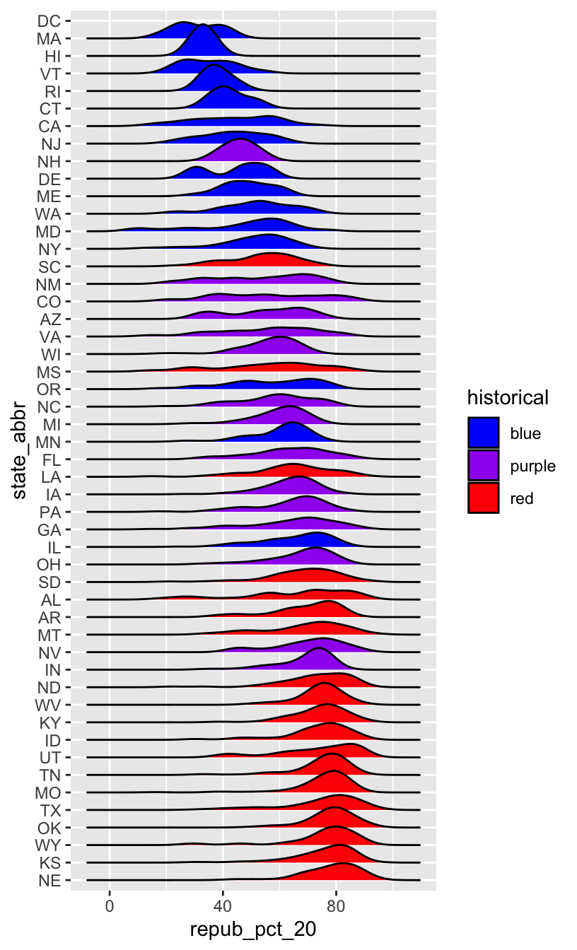
WORKING WITH FACTOR VARIABLES
The forcats package, part of the tidyverse, includes handy functions for working with categorical variables (for + cats):
![]()
Here are just some, some of which we explored above:
- functions for changing the order of factor levels
fct_relevel()= manually reorder levelsfct_reorder()= reorder levels according to values of another variablefct_infreq()= order levels from highest to lowest frequencyfct_rev()= reverse the current order
- functions for changing the labels or values of factor levels
fct_recode()= manually change levelsfct_lump()= group together least common levels
12.2 Exercises
The exercises revisit our grades data:
##      sid grade   sessionID
## 1 S31185    D+ session1784
## 2 S31185    B+ session1785
## 3 S31185    A- session1791
## 4 S31185    B+ session1792
## 5 S31185    B- session1794
## 6 S31185    C+ session1795
We’ll explore the number of times each grade was assigned:
grade_distribution <- grades %>%
  count(grade)

head(grade_distribution)
##   grade    n
## 1     A 1506
## 2    A- 1381
## 3    AU   27
## 4     B  804
## 5    B+ 1003
## 6    B-  330
Exercise 1: Changing the order (option 1)
Check out a column plot of the number of times each grade was assigned during the study period. This is similar to a bar plot, but where we define the height of a bar according to variable in our dataset.
grade_distribution %>%
  ggplot(aes(x = grade, y = n)) +
    geom_col()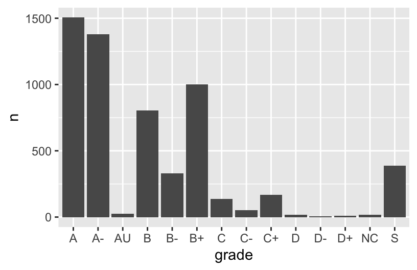
The order of the grades is goofy! Construct a new column plot, manually reordering the grades from high (A) to low (NC) with “S” and “AU” at the end:
# grade_distribution %>%
#   mutate(grade = ___(___, c("A", "A-", "B+", "B", "B-", "C+", "C", "C-", "D+", "D", "D-", "NC", "S", "AU"))) %>%
#   ggplot(aes(x = grade, y = n)) +
#     geom_col()
Construct a new column plot, reordering the grades in ascending frequency (i.e. how often the grades were assigned):
# grade_distribution %>%
#   mutate(grade = ___(___, ___)) %>%
#   ggplot(aes(x = grade, y = n)) +
#     geom_col()
Construct a new column plot, reordering the grades in descending frequency (i.e. how often the grades were assigned):
# grade_distribution %>%
#   mutate(grade = ___(___, ___, ___ = TRUE)) %>%
#   ggplot(aes(x = grade, y = n)) +
#     geom_col()
Exercise 2: Changing factor level labels
It may not be clear what “AU” and “S” stand for. Construct a new column plot that renames these levels “Audit” and “Satisfactory”, while keeping the other grade labels the same and in a meaningful order:
# grade_distribution %>%
#   mutate(grade = ___(___, c("A", "A-", "B+", "B", "B-", "C+", "C", "C-", "D+", "D", "D-", "NC", "S", "AU"))) %>%
#   mutate(grade = ___(___, ___, ___)) %>%  # Multiple pieces go into the last 2 blanks
#   ggplot(aes(x = grade, y = n)) +
#     geom_col()
Up next
Use the remainder of class time to work on Homework!
12.3 Solutions
Click for Solutions
EXAMPLE 1
The categories are in alphabetical order, which isn’t meaningful here.
EXAMPLE 4: Re-ordering factor levels
we would have to:
- Calculate the typical Republican support in each state, e.g. using
group_by()andsummarize(). - We’d then have to manually type out a meaningful order for 50 states! That’s a lot of typing and manual bookkeeping.
Exercise 1: Changing the order
grade_distribution %>%
  mutate(grade = fct_relevel(grade, c("A", "A-", "B+", "B", "B-", "C+", "C", "C-", "D+", "D", "D-", "NC", "S", "AU"))) %>%
  ggplot(aes(x = grade, y = n)) +
    geom_col()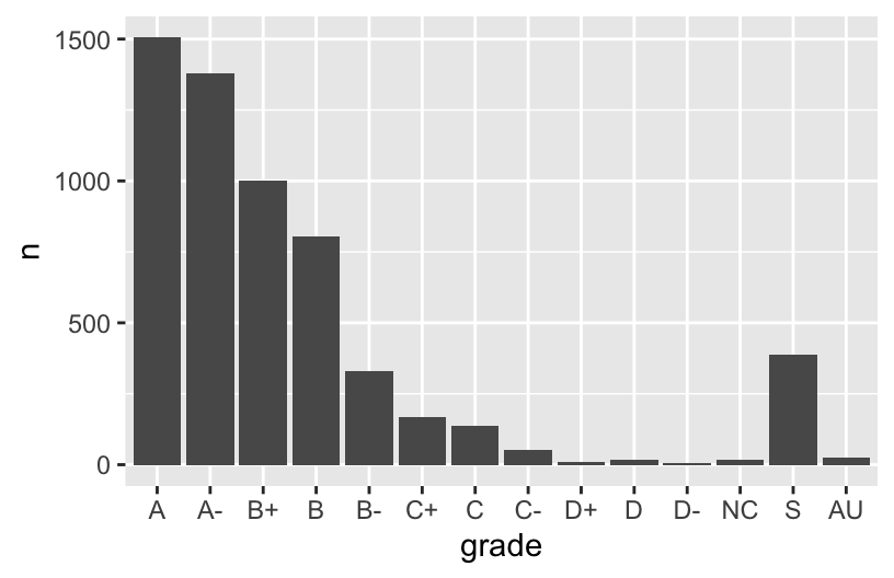
grade_distribution %>%
  mutate(grade = fct_reorder(grade, n)) %>%
  ggplot(aes(x = grade, y = n)) +
    geom_col()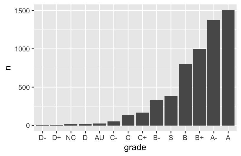
grade_distribution %>%
  mutate(grade = fct_reorder(grade, n, .desc = TRUE)) %>%
  ggplot(aes(x = grade, y = n)) +
    geom_col()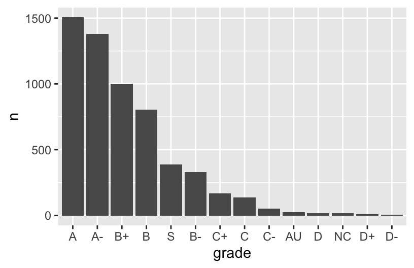
Exercise 2: Changing factor level labels
grade_distribution %>%
  mutate(grade = fct_relevel(grade, c("A", "A-", "B+", "B", "B-", "C+", "C", "C-", "D+", "D", "D-", "NC", "S", "AU"))) %>%
  mutate(grade = fct_recode(grade, "Satisfactory" = "S", "Audit" = "AU")) %>%  # Multiple pieces go into the last 2 blanks
  ggplot(aes(x = grade, y = n)) +
    geom_col()